Hangry Tengu: Passion Project
Over the past couple of years, I went on and off with a passion project of creating an imaginary Japanese-themed restaurant. At the time, I was really fascinated with Japanese mythology, specifically Tengu with their unique faces. I wanted to design a brand revolved around the vibe of a Tengu, hence the name being “Hangry Tengu.”
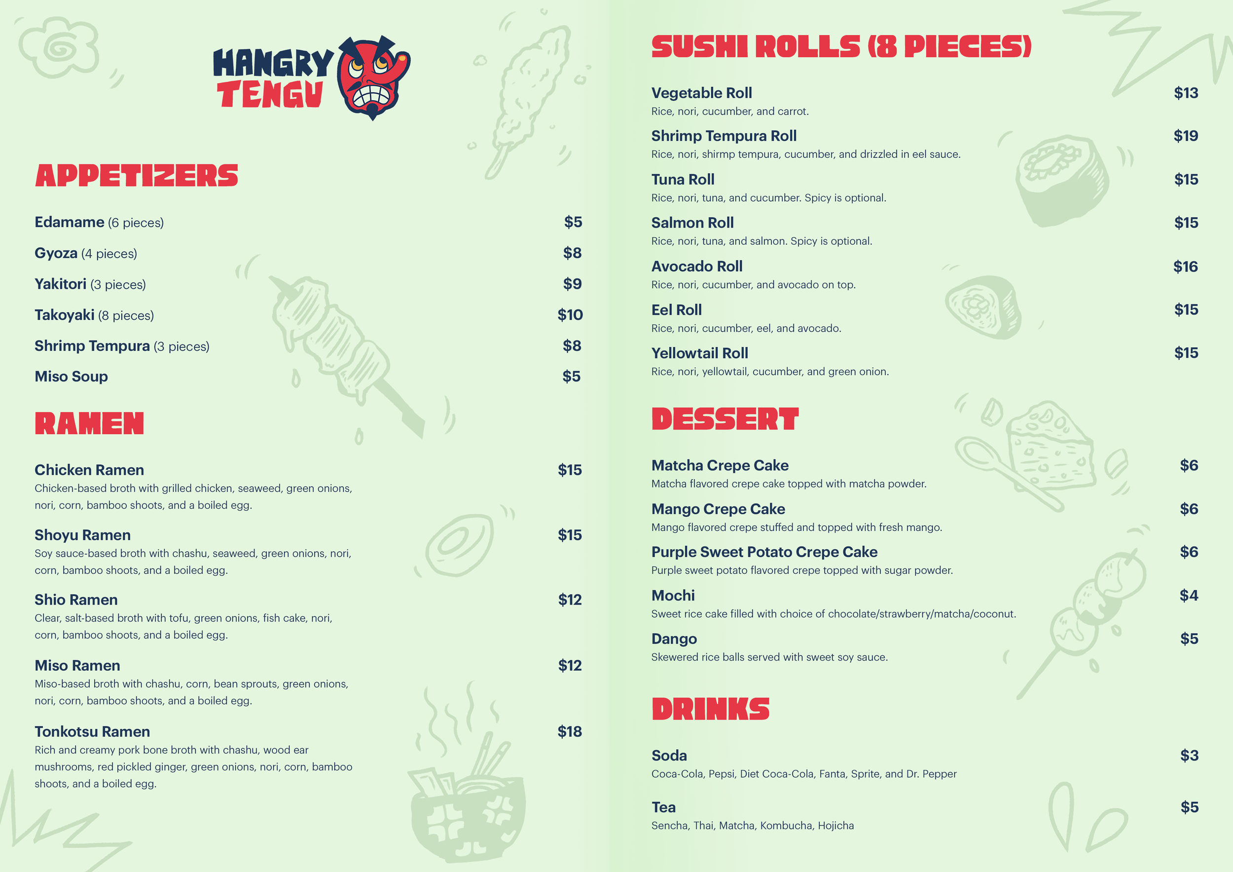
Throughout the many ups and downs within this project, a lot of these deliverables sat in the dust for long periods. But one day, I decided to finally finish this project. I referenced many existing Japanese restaurants showcased on Behance to ensure the aesthetic I convey is appropriate, conveying energy through bold colors, lines, and typography.
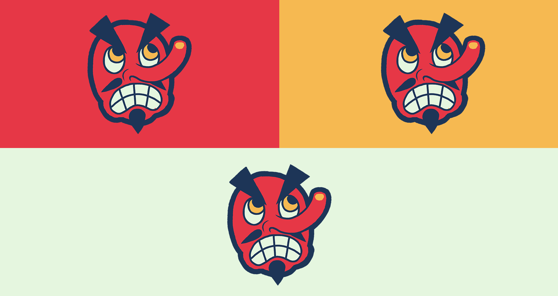
I wanted the logo to represent the Tengu mask in a quirky and accurate way. Since Tengu masks are known for being red, I wanted to pick colors that complemented them and gave off a sense of energy to the overall feel of the brand. I wanted to choose typography that would compliment the dynamic nature of the logo and its wordmark to make everything balanced and cohesive.


