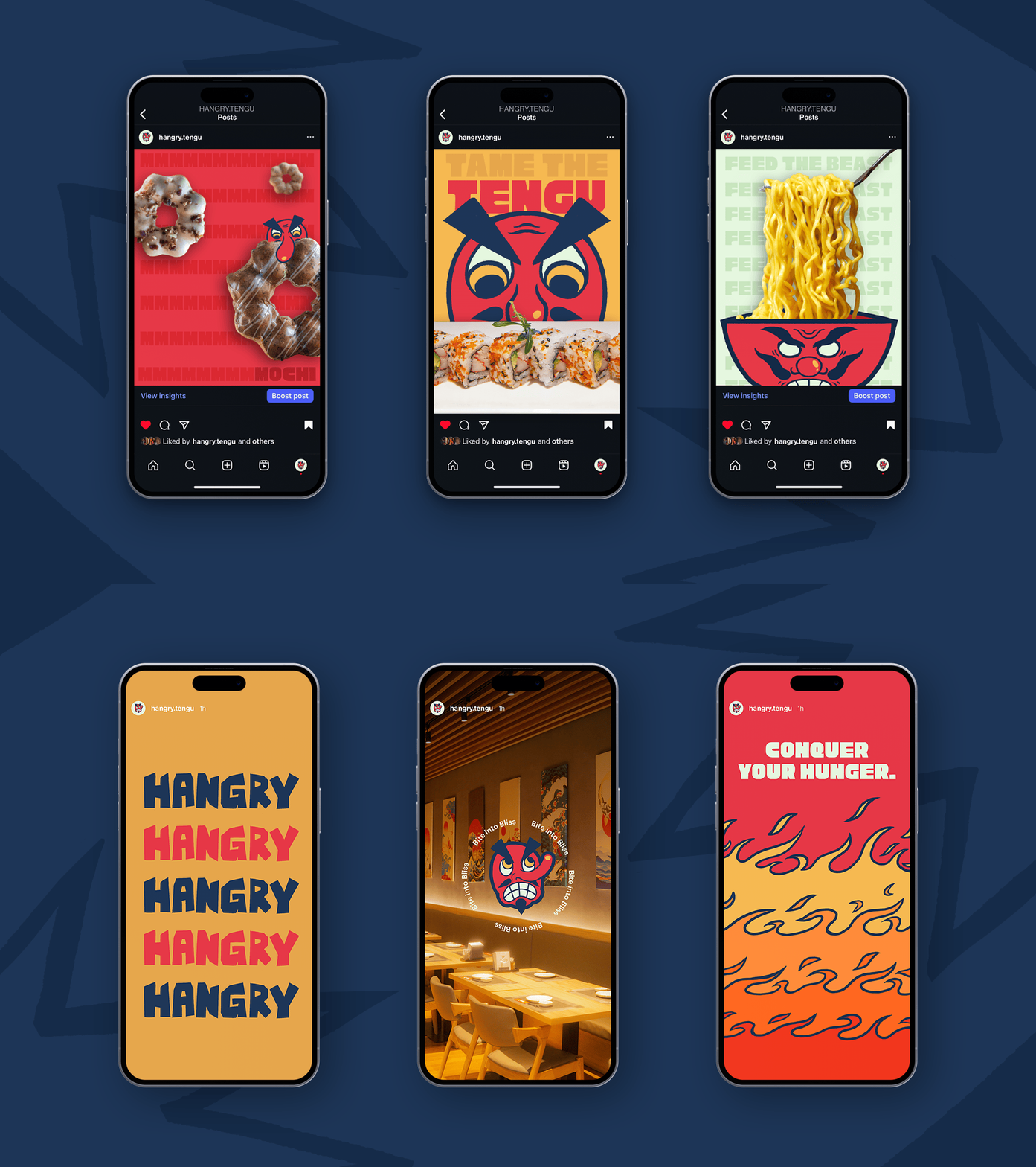
Hangry Tengu
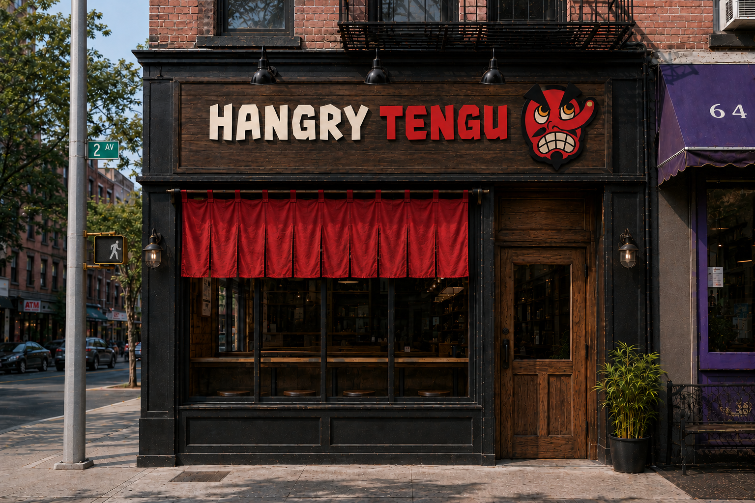
The Scope:
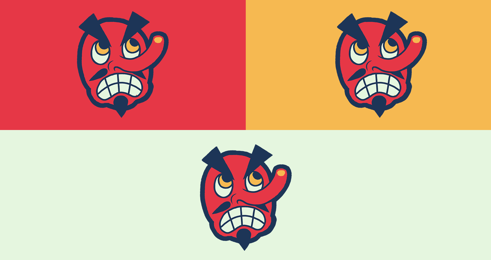
Hangry Tengu is a bold, modern Japanese restaurant brand inspired by the legendary Japanese Tengu, reimagining traditional folklore with a playful, contemporary twist. Tengus are supernatural beings that are depicted as guardians and full of wisdom, or tricksters that put people in their place. Considering the brand wanted to be fun and playful, the latter was chosen.
The Solution:
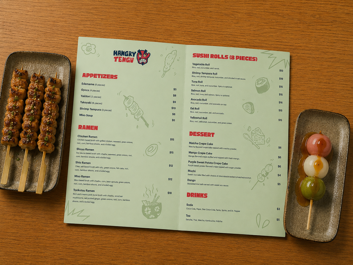
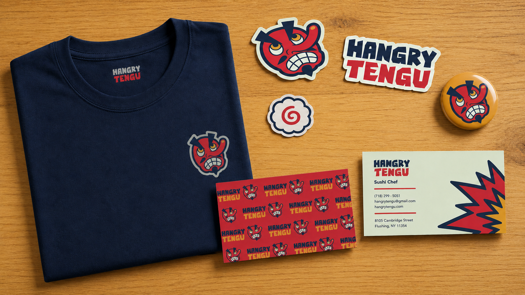
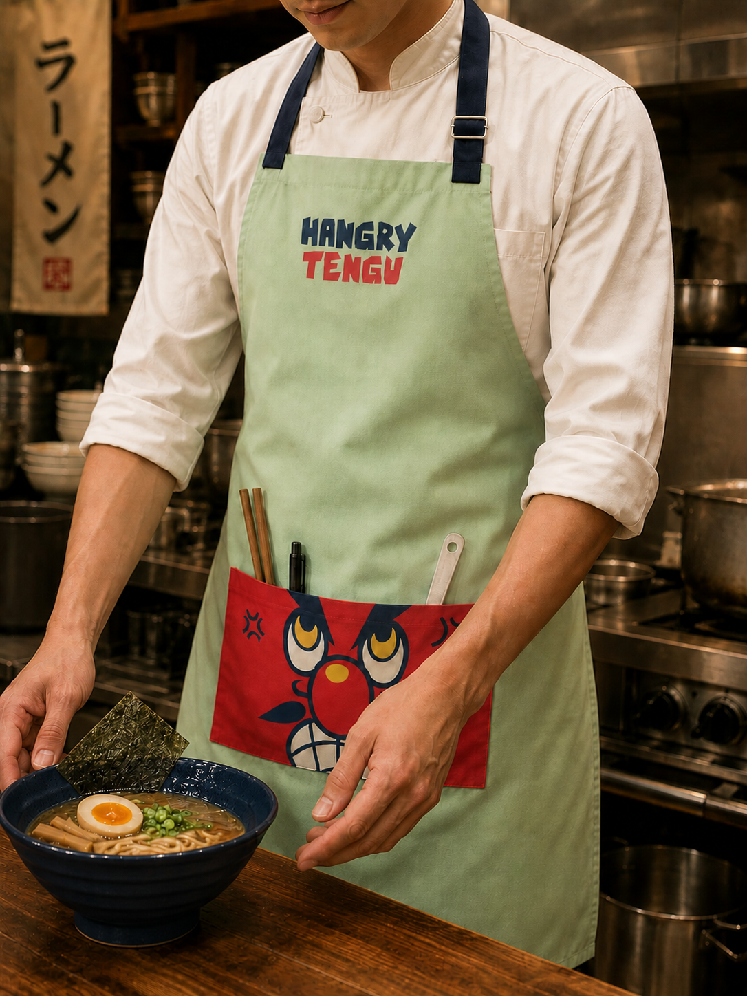
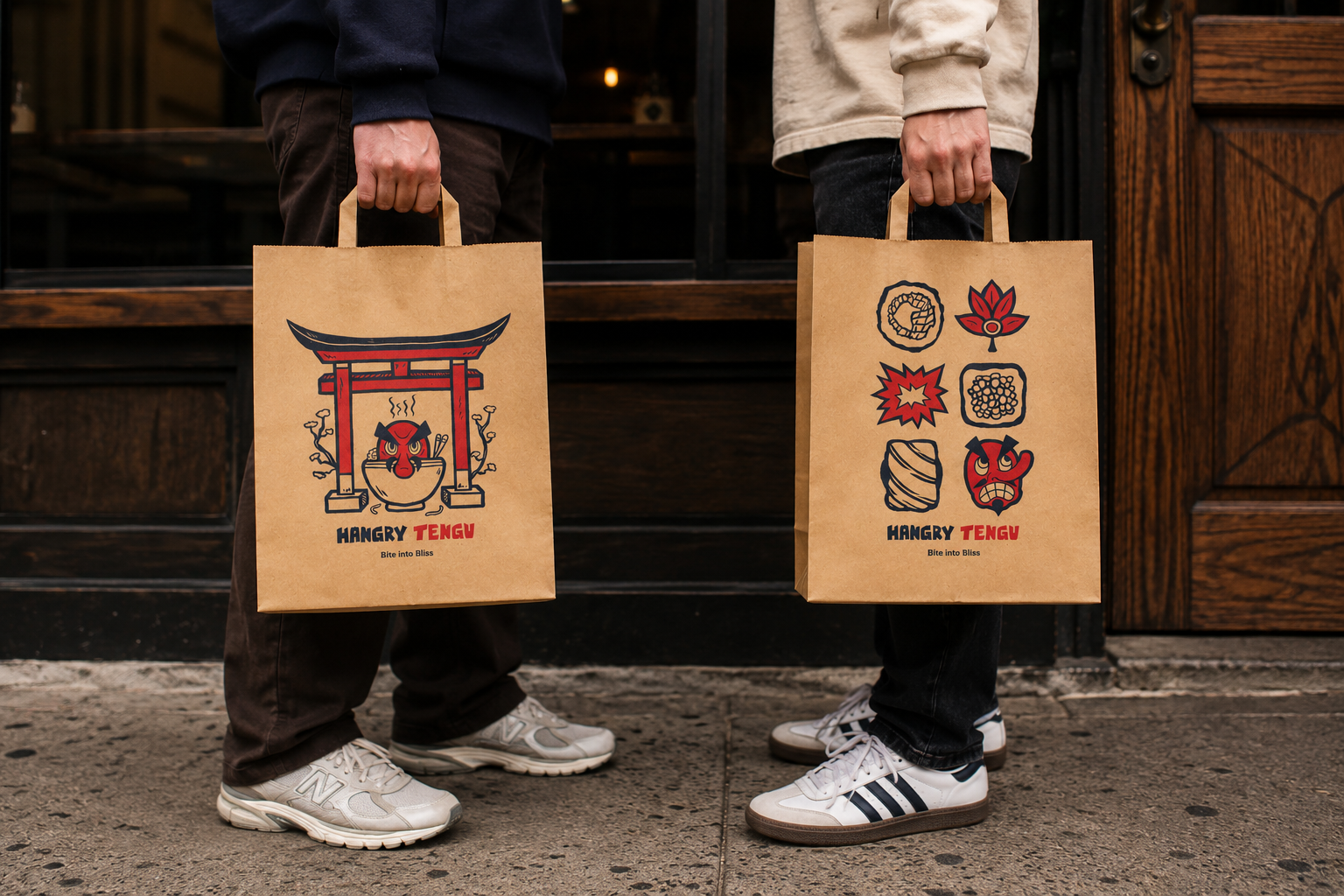
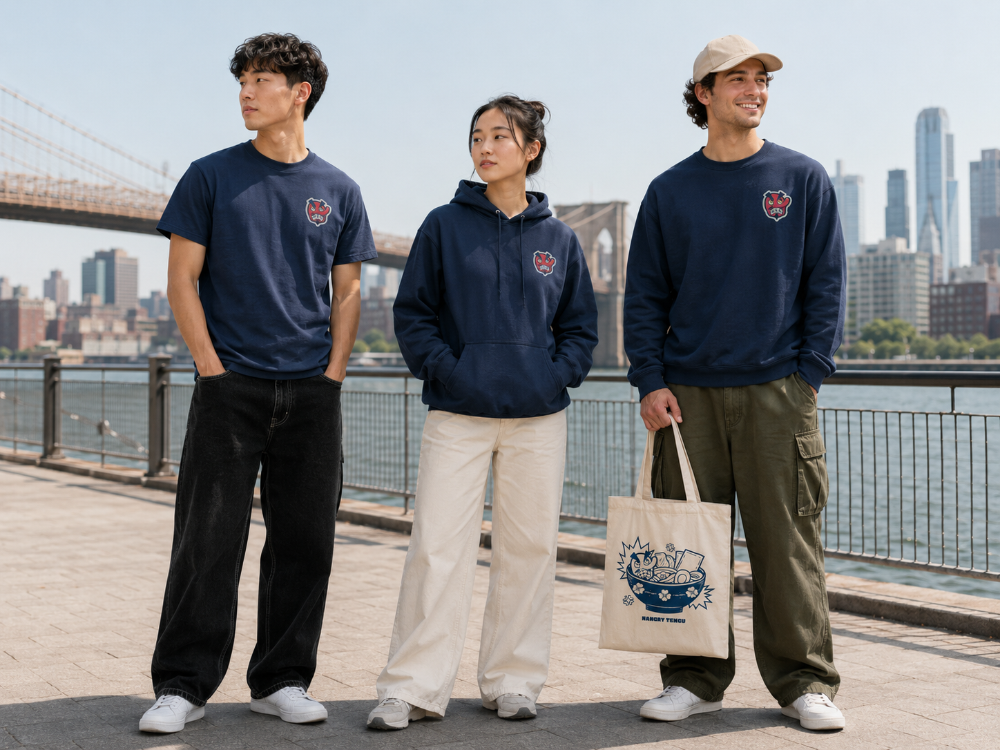
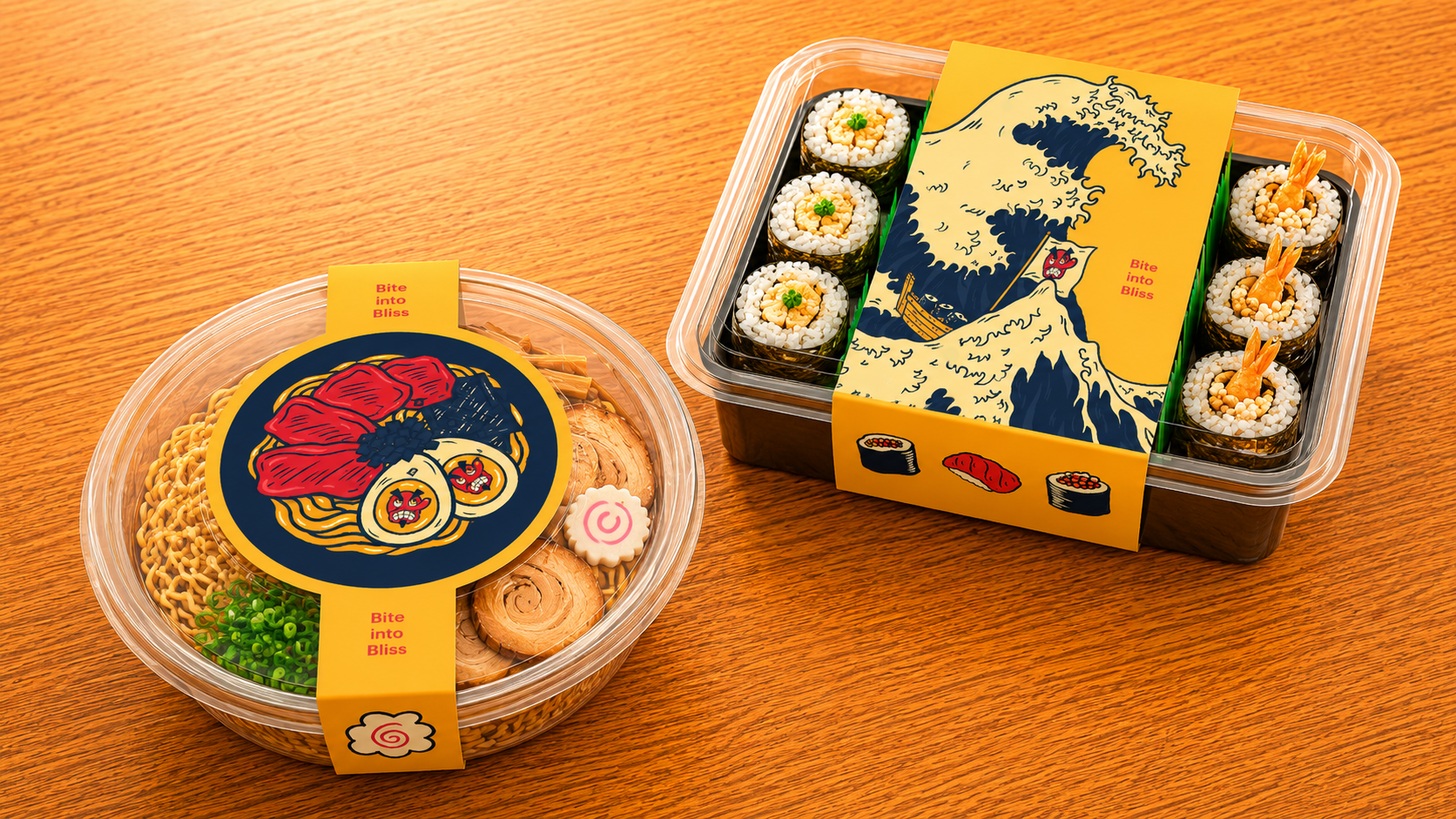
The identity combines expressive illustrations, vibrant packaging, and dynamic typography to create a memorable fast-casual dining experience that feels both authentic and energetic.
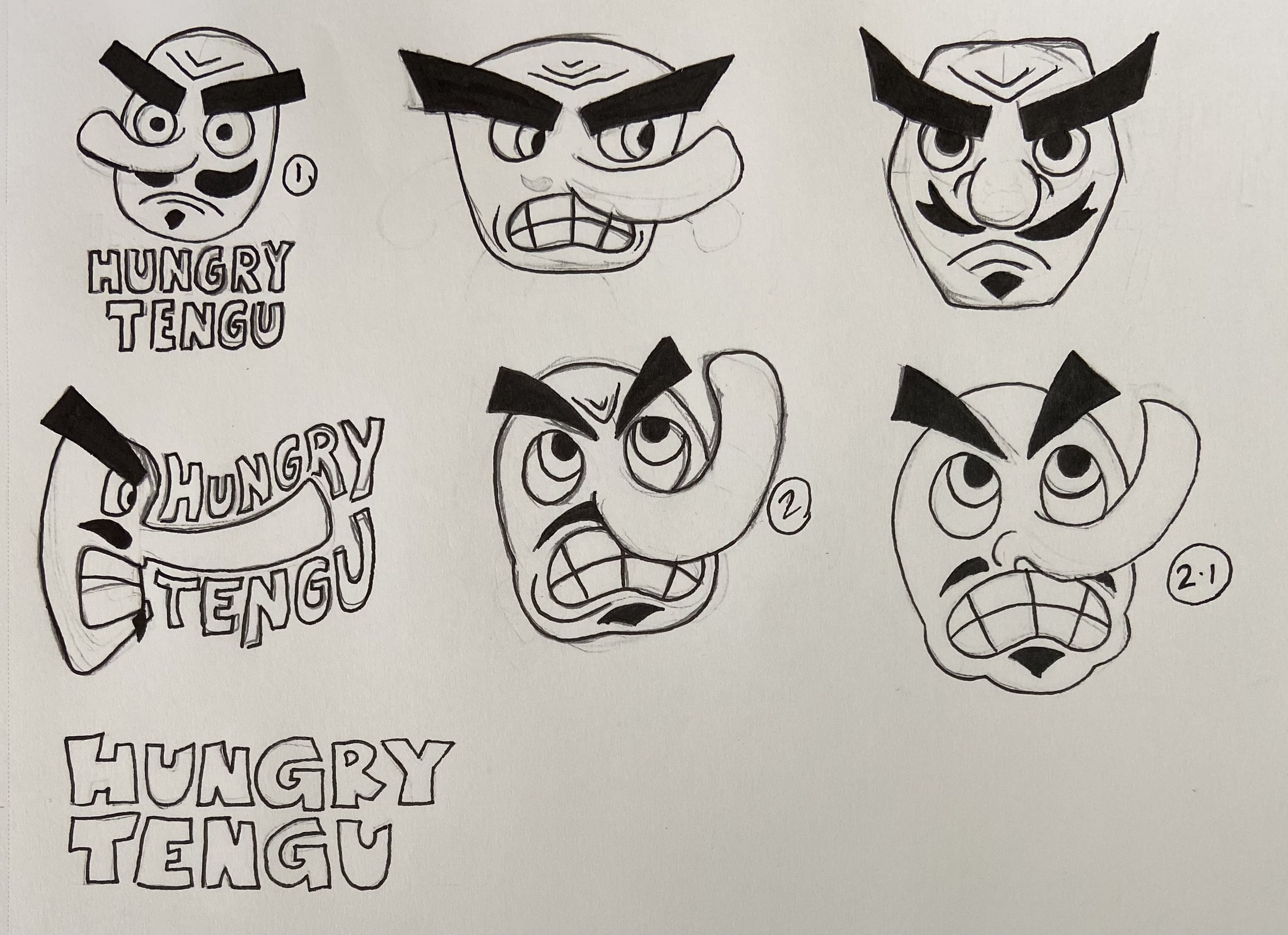
Brand Identity Development:
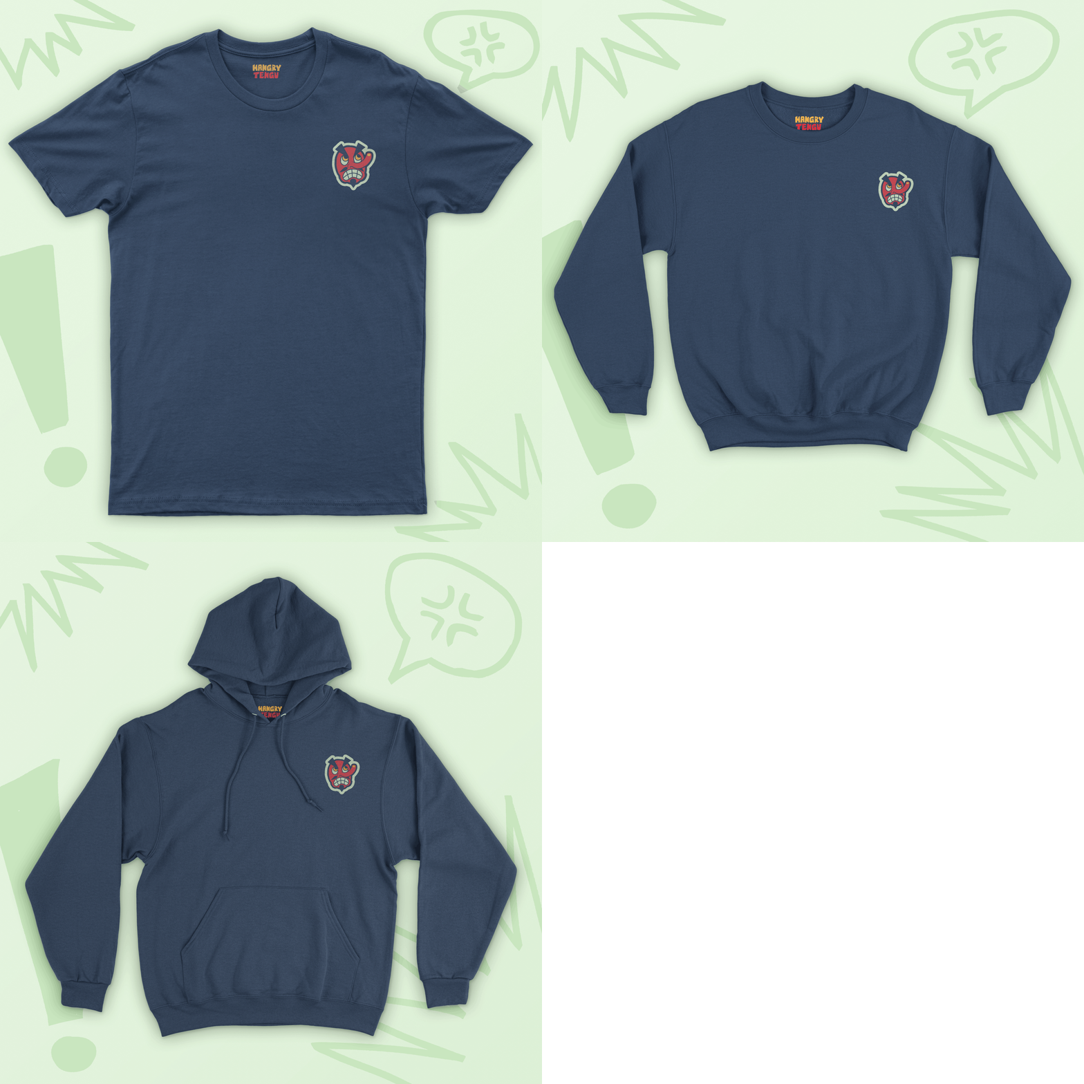
I wanted the logo to represent the Tengu mask in a quirky and accurate way. Since they’re most known for being red, I picked colors that complemented it and gave a sense of energy to the overall feel of the brand. I wanted to choose typography that would complement the dynamic nature of the logo and its wordmark to make everything cohesive.